


Bitcoin One chart shows repeated declines after the FOMC, while another shows a cluster of declining liquidity that could push prices down, facing another pressure point. Taken together, these settings suggest that macro pressures and leverage positioning will shape Bitcoin’s next move.
Bitcoin charts show FOMC-linked decline could put pressure on BTC in 2026
Bitcoin has fallen between 6% and 30% after each of the past six Federal Open Market Committee meetings, according to a chart shared by analyst Ted Pillows. This chart shows several sharp declines from mid-2025 to early 2026, indicating a repeating pattern of post-FOMC weakness. Based on that structure, analysts said an additional 6% drop could take Bitcoin closer to $67,000, while an additional 30% drop could bring it closer to $50,000 in 2026.
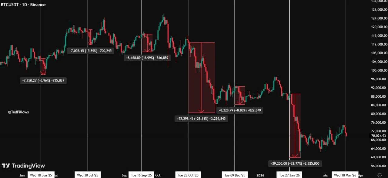
Bitcoin FOMC decline comparison: Source: ted pillow
This chart highlights multiple corrections clustered around the FOMC date, with a smaller decline around 6% to 9% and two large declines of over 28%. This pattern suggests that macro events continue to shape short-term Bitcoin price movements. In AP parlance, the chart does not confirm that the same move will occur again. But it shows that traders have repeatedly reduced the risk of the Fed’s decisions, especially when broader market sentiment has weakened.
Nevertheless, the graphs show these levels as scenario goals rather than confirmed results. A rise to $67,000 would match the lower bound of the recent FOMC-led decline, while a decline to $50,000 would reflect a larger risk-off event. As a result, the chart depicts 2026 as a period in which Bitcoin remains highly sensitive to Fed policy signals and broader market reactions.
Bitcoin Liquidation Heatmap Shows Liquidity Clusters Acting as Price Magnets
Bitcoin’s liquidation heatmap highlights dense liquidity clusters formed in low ranges with high concentrations of highly leveraged positions. This type of structure often acts as a magnet, as price tends to move towards areas where there is a large pool of liquidation levels. The chart has shown repeated interactions with similar zones in the past, with the price moving into these areas before stabilizing or reversing.
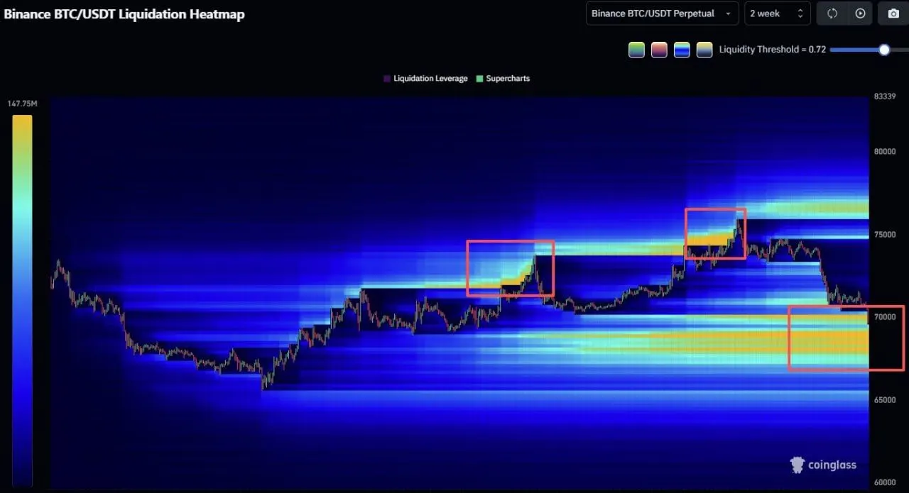
Bitcoin liquidation heatmap: Source: coin glass
At the same time, the previously highlighted zone around the regional high shows how liquidity accumulated above the price before a sharp rejection followed. This pattern reflects how leveraged positions increase volatility in both directions. As liquidity builds up, prices can rise and cause liquidations. However, once these positions are unwound, the market often shifts towards the next pocket of liquidity.
The focus now shifts to the bottom highlighted band. Here, the liquidation level remains more concentrated. This suggests that downward pressure may persist until liquidity is resolved. As a result, the chart frames the current structure as a liquidity-driven setup rather than a pure trend-driven move, allowing price to react where leverage is most concentrated.